As an administrator, you can freely select the CI properties of your app instance in the Admin Dashboard and adapt them at any time.
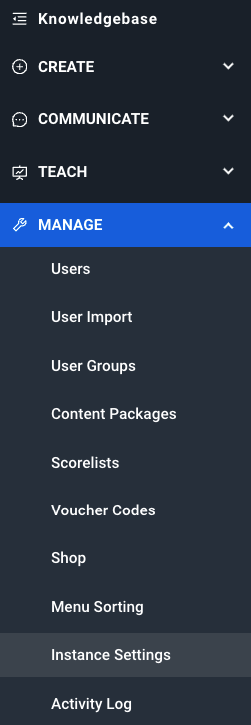
Go to the menu item Manage and Instance settings to access the CI settings.
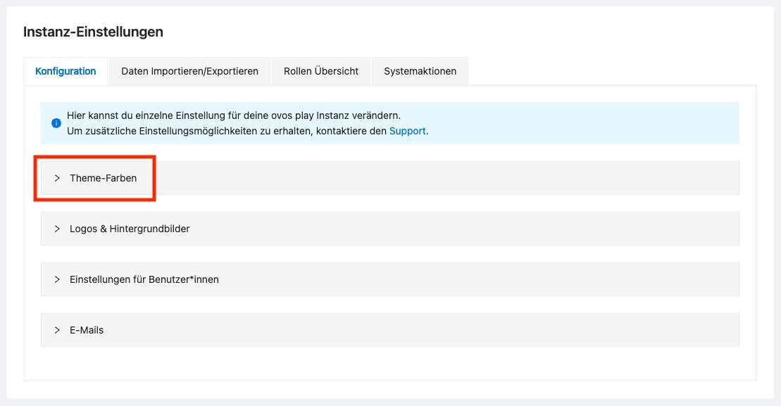
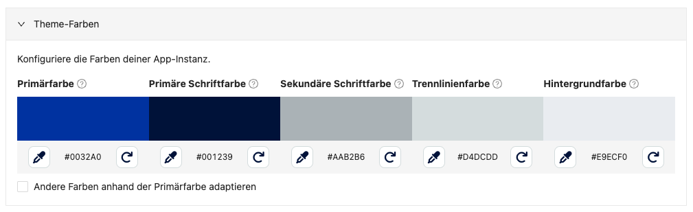
On this page you will find various settings areas. For the color settings, expand the Theme colors area.
In the Theme colors section, you will find a color palette with the colors already used.
Click on the pipette icon to adjust a color. A window with a color slider opens. In this color slider, you can select the color from the color field by clicking in the desired color position. Use the lower bar to select the desired color. You can also enter the color with the respective HEX code.
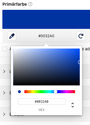
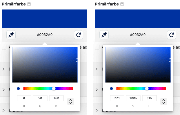
You can use the reset icon to reset the color to the default value. You can also use the arrow symbol to display an RGB or HSL mask.
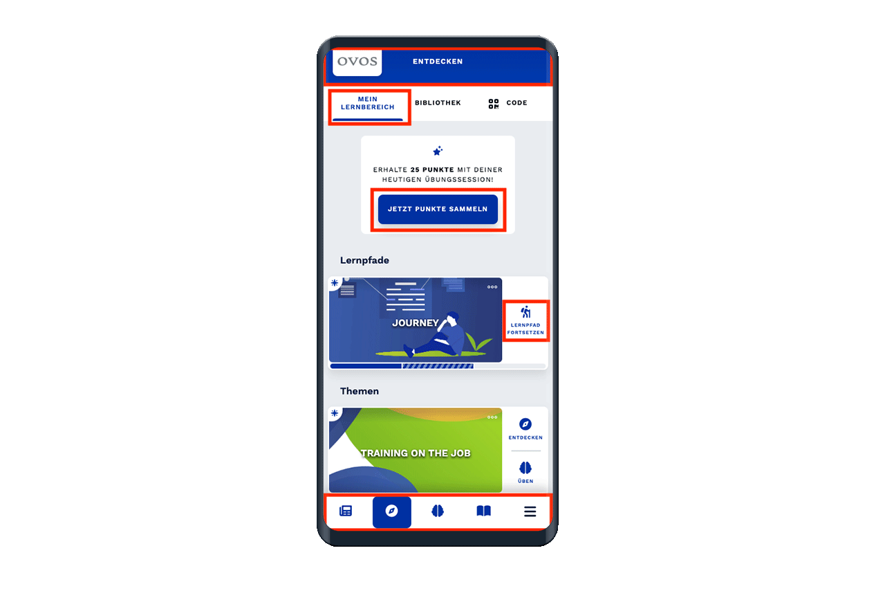
To find out what effect the selected color has on the app, move the mouse cursor over the question mark symbol next to the name of the color.
You can adjust the following colors:
The primary color is used as the main color and for highlights such as headings or buttons.
The primary font color is used for all continuous texts, labels and all texts that are not formatted as headings.
The secondary font color is used on secondary buttons (e.g. "Close"), placeholders and hint texts.
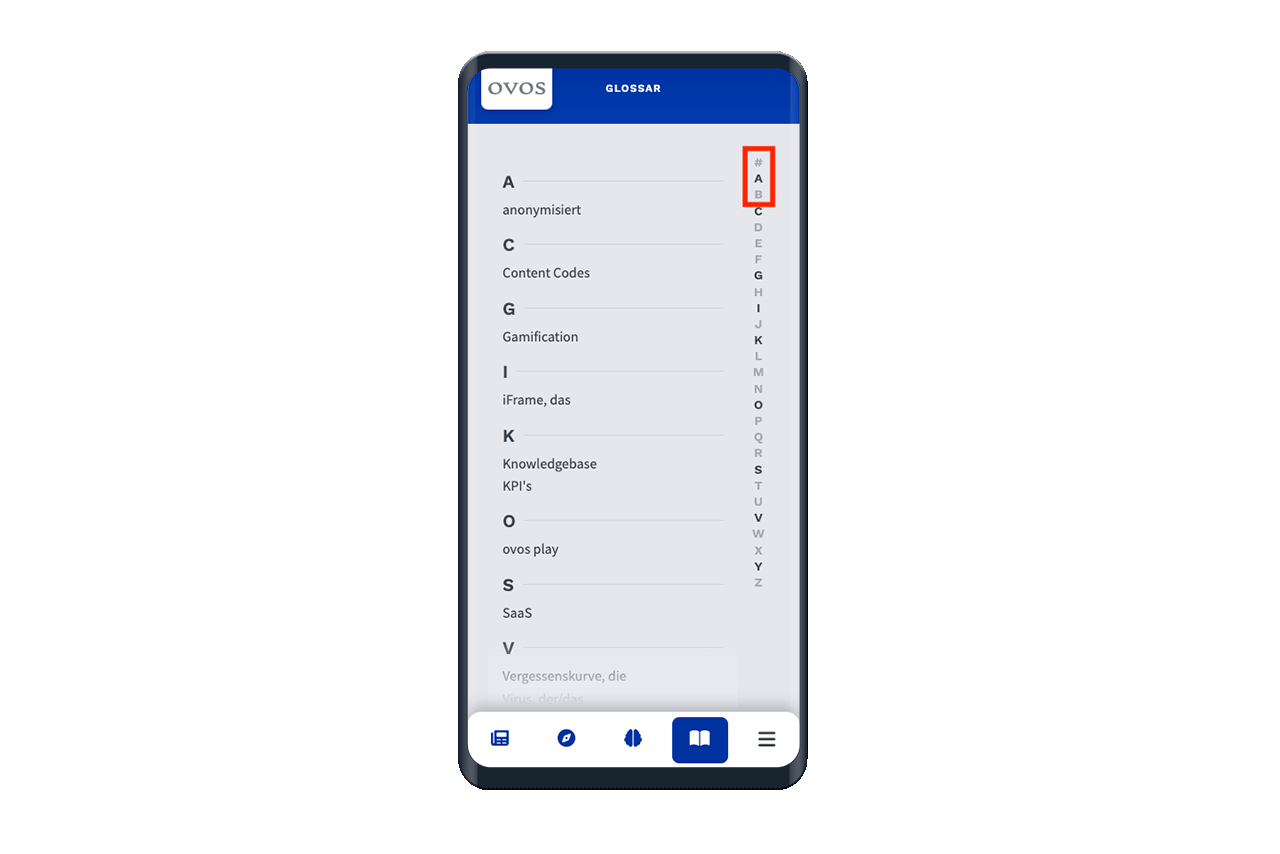
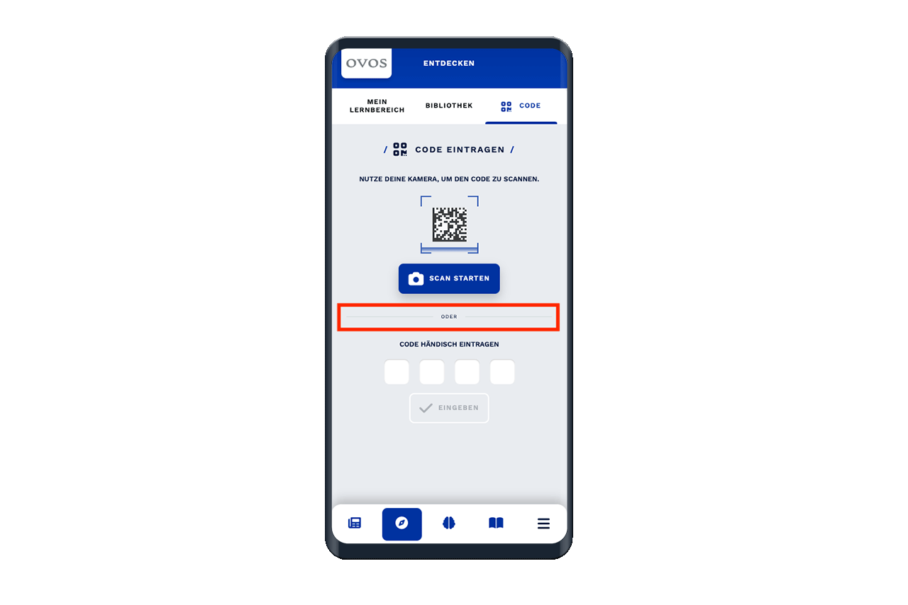
The separator line color defines the color for separator lines within content or in the code scanning module.
The background color is used for all page backgrounds.
Go to the menu item Manage and Instance settings to access the CI settings.

On this page you will find various settings areas. For the logo and background settings, expand the Logos & background images section.
In this area you will find image upload fields for the respective images that are displayed in your app instance.
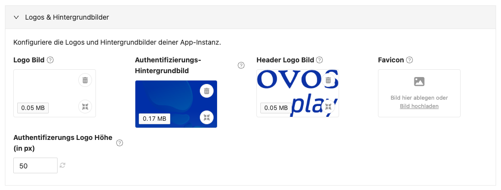
Drag & drop the image files for logos into the respective image upload fields or click on the fields to open the file storage of your operating system and select the desired image file.
Move the mouse over the question mark symbols to display more information on the respective upload field.
You can customize the following images:
This logo is placed on the authentication background image. The logo image is also used as the logo for the Admin Dashboard menu.
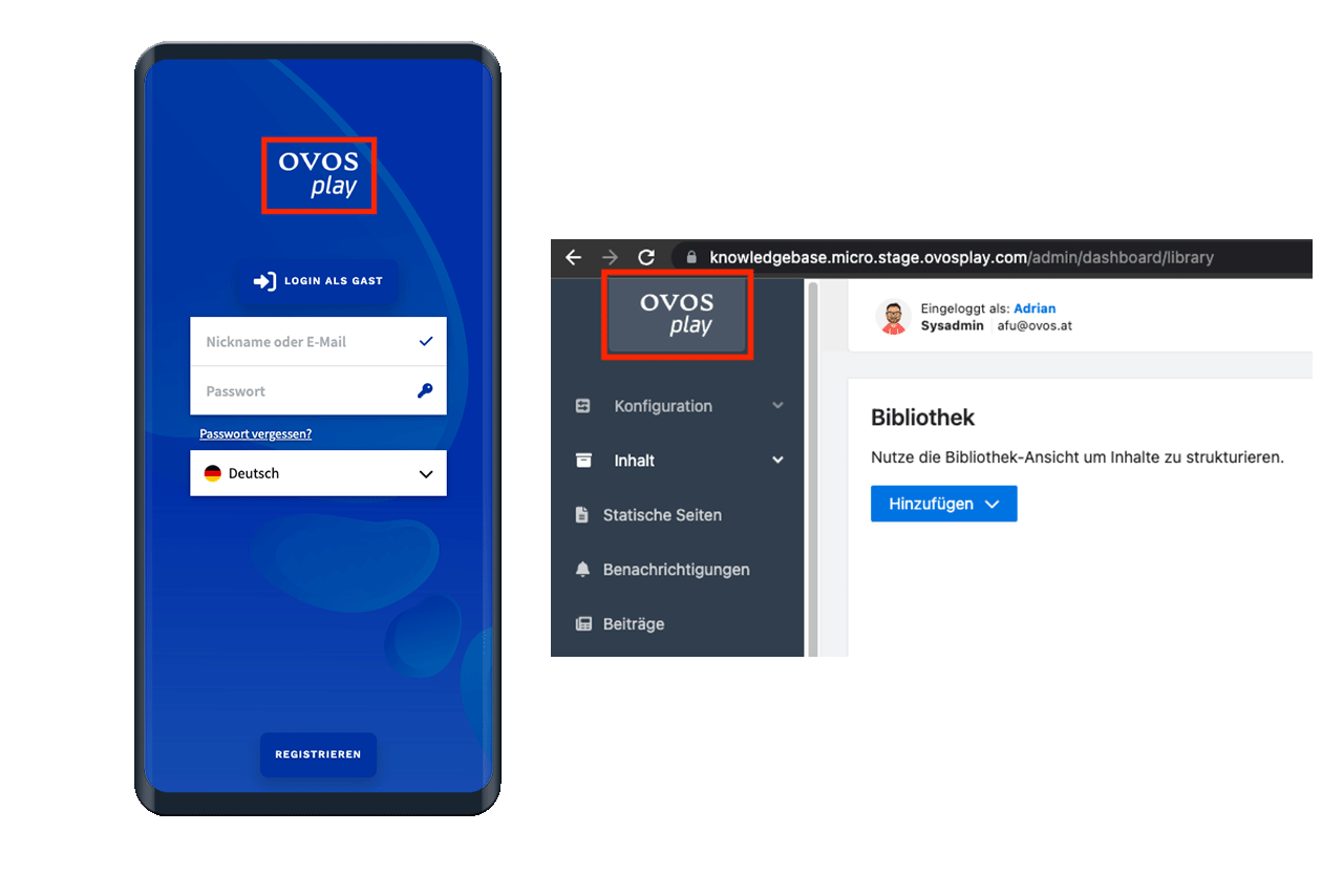
Note: The logo image is displayed on the authentication background. If required, use a logo with a transparent background.
This image is displayed as the background on the authentication page. The background image is adapted to the size of the end device and cropped if necessary.
If only the mobile version is used as an app, we recommend the following image settings:
720 x 1280 pixels (or equal ratio)
smaller than 200kb
.jpg (for detailed images)
.png for illustration graphics
If the web version is also used, we recommend using a 16:9 landscape format, but placing the focus of the design for the mobile version in the middle.
This image is used for the login screen of the Admin Dashboard. The background image is adapted to the size of the end device and cropped if necessary.
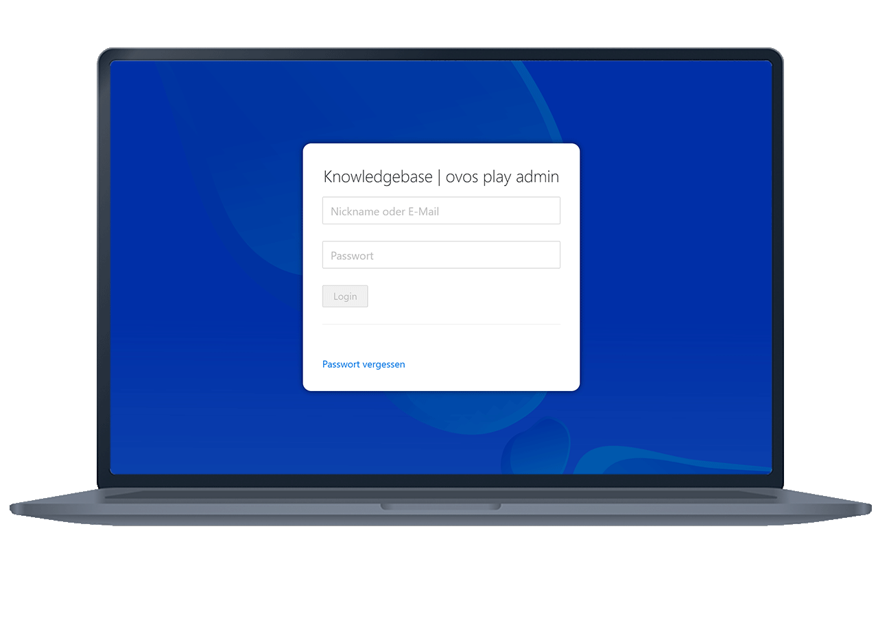
The same image recommendations apply as for the authentication background image.
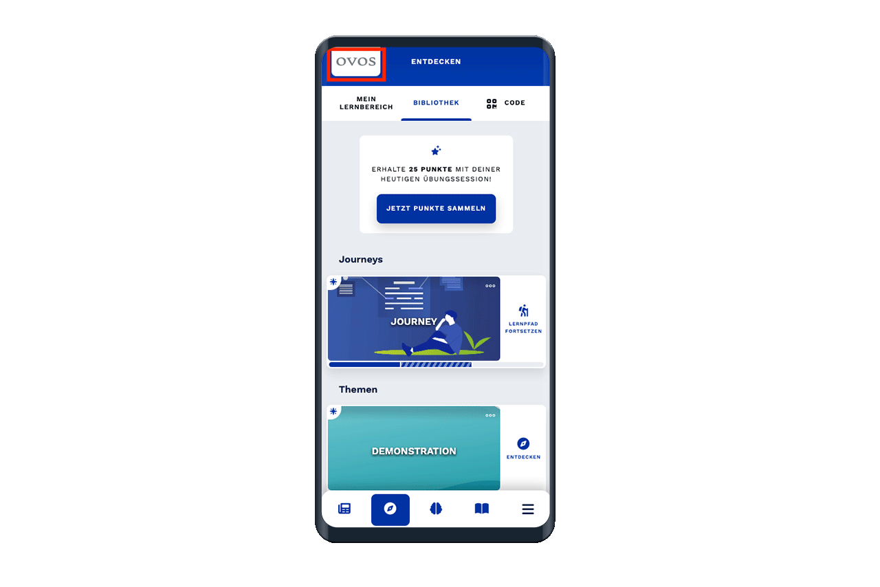
This logo is displayed in the top left-hand corner of the app. The logo is displayed on a white tile. Clicking on it takes you to the first main page in the app.
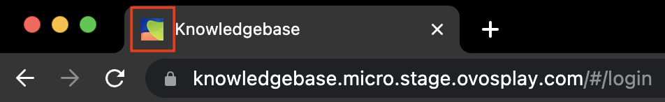
This icon is displayed in the browser tab. The display size varies depending on the browser used. We recommend a modification of the logo in a 1:1 format without text or small details.
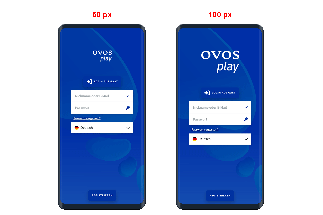
Use this setting to define the size of the logo on the authentication page. The default setting is 50 pixels. If you change this setting to 100 pixels, for example, the logo will be displayed twice as large.
Note: 100 pixels is the maximum.