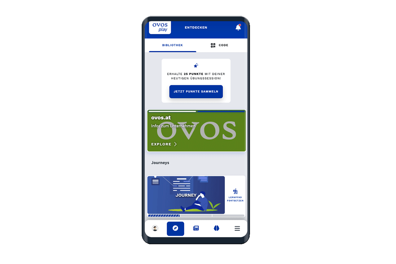
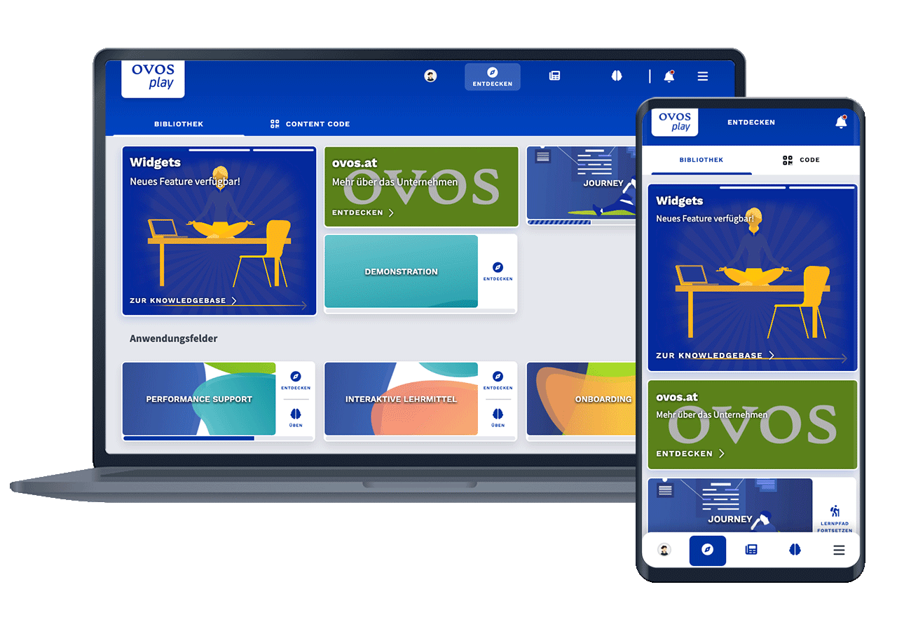
Widgets are displayed in the library next to topics and learning paths. They can be displayed in different sizes to prominently highlight widget content.
Three sizes are available:

The normal size of widgets is the same size as topics and learning paths. The normal size is displayed identically in the desktop and mobile variants.
This size is particularly suitable for:
Collections of links to external websites.
References to imprint, data protection or sponsors.
Recommendation for image size:
Landscape format 3:1
Recommended resolution: 600 x 200 pixels
.jpg, .png or.gif
smaller than 200 kB
The square size is the same width as the normal size, but twice as high. In the mobile version, the square size fills the width of the screen. In the desktop version, the square size is fitted into the layout depending on the sorting of the library elements.
The square size is particularly suitable for:
Highlighted display of new external content.
Square background images.
Embedding iFrames (e.g. video streams).
Recommendation for image size:
Square format 1:1
Recommended resolution: 600 x 600 pixels
.jpg, .png or.gif
smaller than 200 kB
The banner size is the largest of the available sizes. With the banner size, the widget is stretched to the full width. The banner size is different in the desktop and mobile version. In the desktop version, the banner is wider than normal themes. In the mobile version, the banner remains the same width to match the image format of the desktop version.
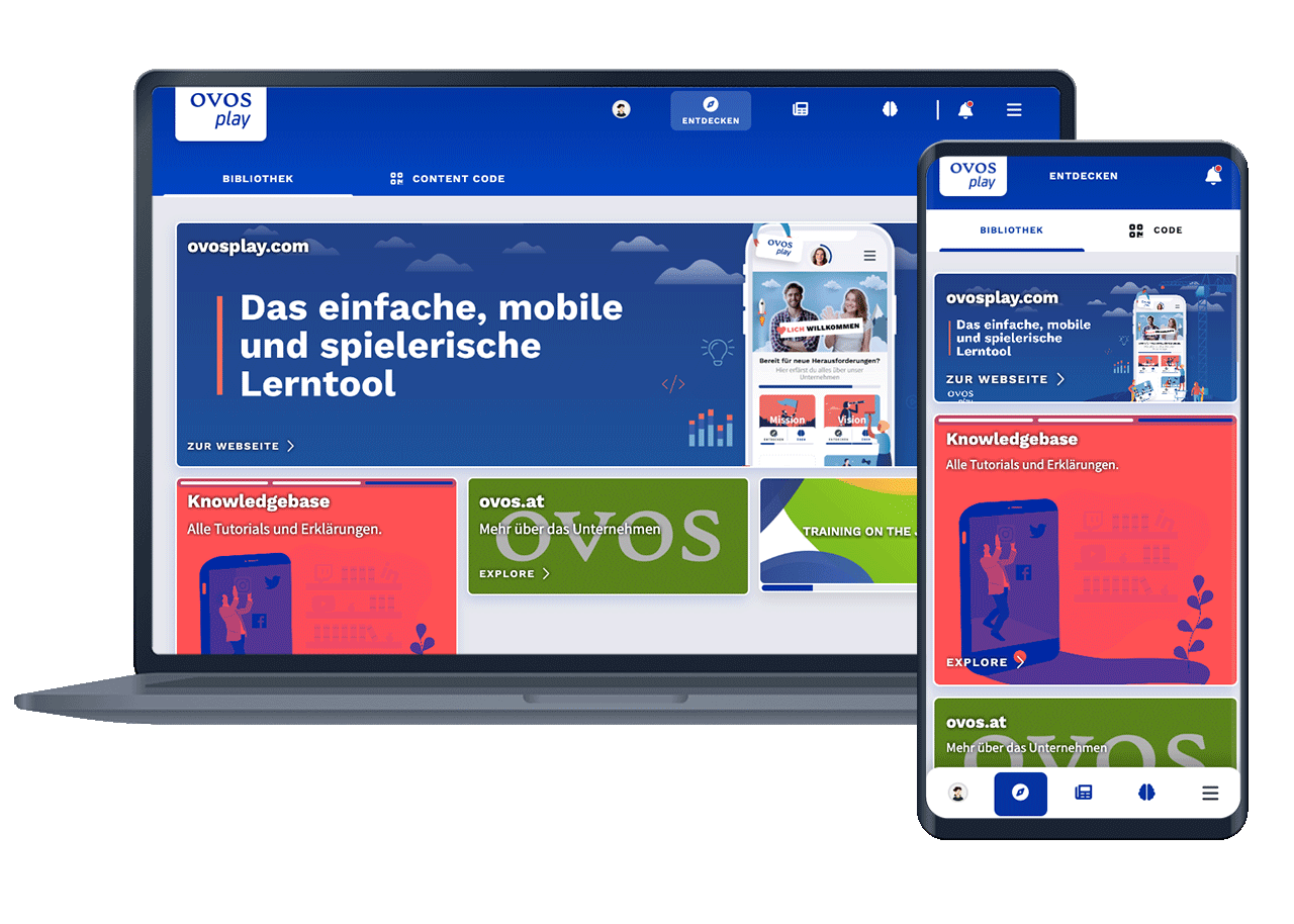
The banner behaves like a subheading in the library: The library items below are displayed in a new line.
The banner size is particularly suitable for:
The most important contents.
Thematic introduction to the following library elements.
Large banner galleries with several links and images.